






The Colorist’s Beauty Retail Store Design: The Color-Coded Playbook
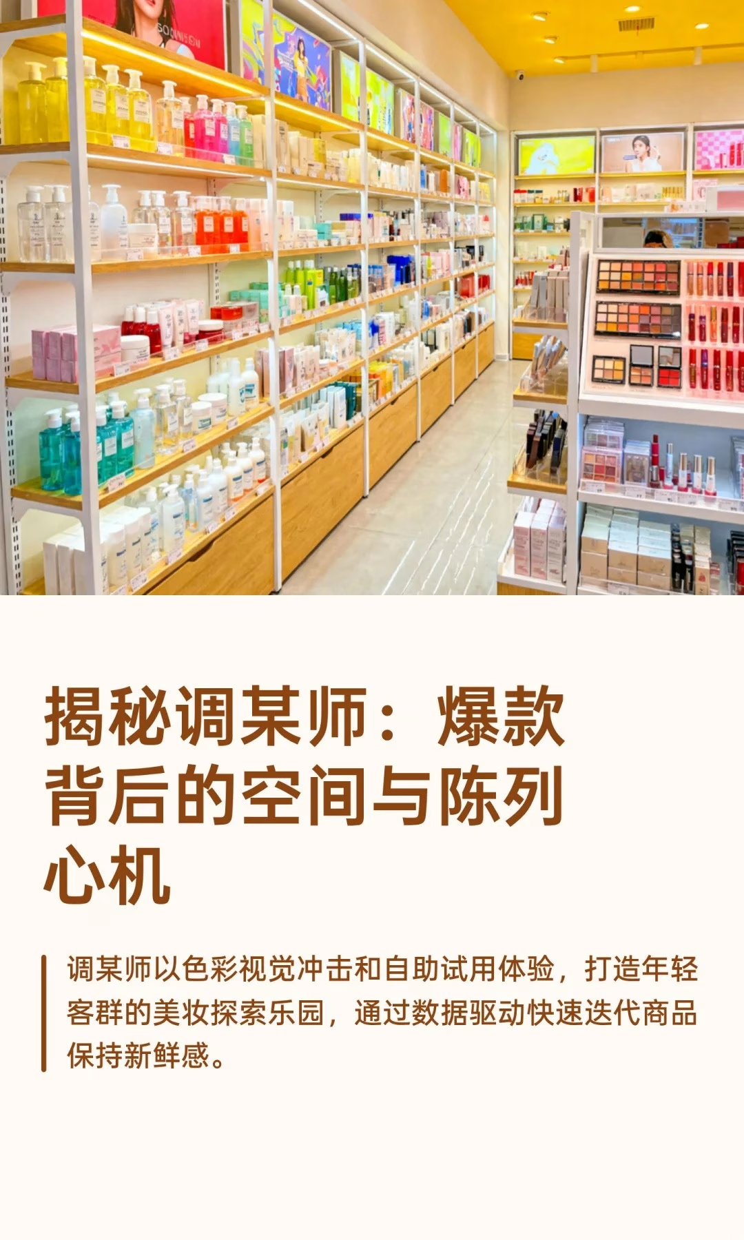
Beauty retail store design has a genre of its own, and The Colorist has built its entire format around color, self-directed trial, and pressure-free service — a sharp departure from the traditional, advisor-led beauty counter.
Foot Traffic: Guided Exploration and Immersive Experience
The entrance often features a bold visual installation — a wall of makeup sponges, for instance — in vivid color, pulling shoppers in from a distance and sparking the urge to photograph and share before they’ve even picked up a product. Stores typically use a circular or U-shaped main aisle, with wide passages and open sightlines that minimize blocked views, while high-frequency categories sit near the front along the main path to pull shoppers deeper in, and more experiential categories sit toward the back to pull traffic through the whole store.
Display Principles: Color-Led, Self-Service Trial
Heavy use of rainbow gradients and color-zoned arrangement creates strong visual impact and lets shoppers quickly filter products by color preference rather than by brand name alone. Ample testers are available throughout the store, grouped by category, making it easy to try and compare across brands side by side — dramatically raising the quality of the in-store experience. A “no sales approach, don’t-disturb” service model means beauty advisors don’t proactively follow or pitch, but do offer expert advice when a shopper actually asks for it, giving younger shoppers an autonomous, relaxed environment to explore.
What Sets The Colorist Apart
Large themed installations and bold color-blocking strongly trigger the urge to share, making the store itself a “destination” and a “photo pilgrimage site” rather than simply a functional retail space. A “hit-product strategy” paired with a digital selection system drives extremely fast turnover, keeping the assortment feeling perpetually fresh. And the brand’s real edge comes from selling “freedom” — making the trying process matter more than the buying, a sharp departure from a traditional beauty store’s sales-led model that leans on advisor persuasion instead of self-directed discovery.
Bottom line: through visual magnets, color-blocking, no-pressure service, and data-driven rapid iteration, The Colorist has built a “high-conversion beauty exploration playground” that wins over a young consumer base traditional retail consistently struggles to reach.
The transferable lesson for any beauty or personal-care retailer is that removing sales pressure isn’t the same as removing service — it’s replacing pushed recommendations with abundant, self-serve trial. Stocking enough testers that a shopper never has to ask permission to try something, and organizing them so comparison is effortless, does more to build purchase confidence than a script-following sales associate standing nearby ever will.
A short checklist for a color-led, self-service beauty format:
- Organize shelving by color family before organizing it by brand
- Stock genuinely sufficient testers so no shopper has to ask permission to try something
- Train staff to answer only when asked, rather than defaulting to proactive pitching
- Build at least one bold, photo-worthy installation near the entrance to signal the store’s personality instantly
Related: Pop Mart’s IP-centered retail design 和 experiential retail marketing’s scenario secret. External reference: Cosmetics Business covers retail trends in the beauty and personal-care category as a dofollow citation.