










Retail Display Standards: The Coca-Cola Case Study
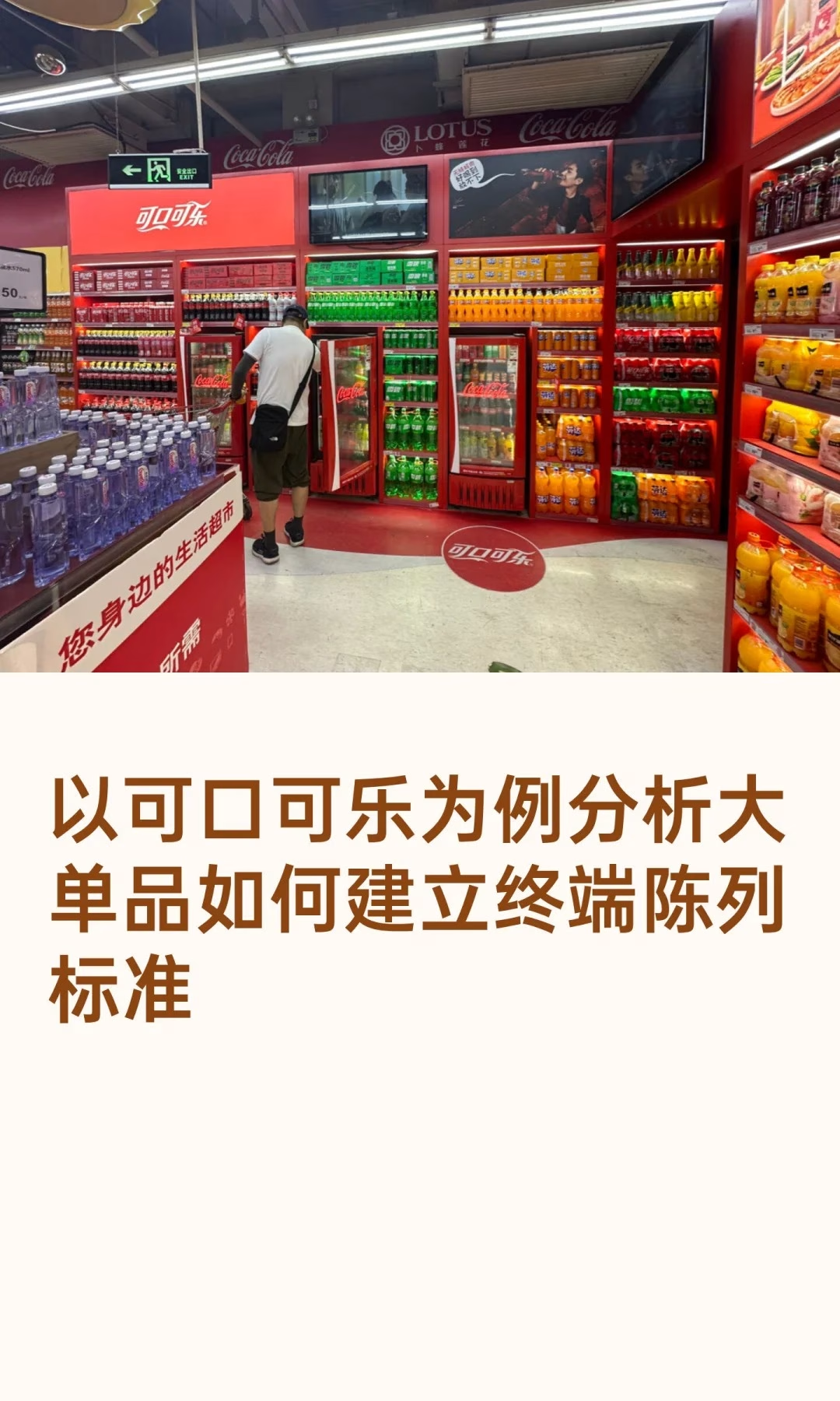
Coca-Cola’s terminal display is a precision exercise in visual merchandising. The core of its retail display standards is simple to state and hard to execute: put the product where it’s most visible and easiest to grab, in its most visually powerful form, and let that drive the sale. It breaks down into five dimensions.
1. Position: Capturing the Golden Traffic Zone
Product must occupy the shopper’s eye-level sightline — the 70–160cm golden-height zone — and be densely deployed across high-traffic areas like checkout counters, main-aisle end caps, and store entrances. The brand also applies the “right-hand rule,” placing product immediately to the right of a bestselling item to intercept the shopper’s line of sight at the moment it’s most likely to land.
2. Space: Building Visual Dominance
Through concentrated and vertical display, the product forms a continuous, striking block of brand-red — maximizing shelf face to command attention through sheer visual force and signal “this is what everyone’s buying” before a shopper has even read a single word.
3. Appearance: Protecting Brand Dignity
Clean, dust-free product and shelving is the baseline expectation. Clear, prominent pricing and promotional information is critical, since unclear information reliably causes customer drop-off at the shelf. Strict FIFO rotation ensures product freshness at all times, protecting the brand from ever being associated with stale stock.
4. Structure: Executing a Full-Range Formation
A fixed product sequence — Coke, then Sprite, then Fanta — reinforces the brand’s lineup as a coordinated front rather than a scattered assortment. Full-range coverage meets diverse shopper needs in one place, and scenario-based cross-merchandising, bundling with snacks or fast food, actively drives incremental consumption beyond the core purchase.
5. Price: Reinforcing Promotional Impact
A full, stable end-cap display paired with eye-catching POP signage builds a powerful promotional visual focal point at key locations, effectively communicating value and triggering impulse purchase without needing a deep discount to do it.
Bottom line: this standardized system is built on deep consumer psychology insight. Its success depends on frontline staff making daily micro-adjustments and executing with discipline — ensuring Coca-Cola consistently stands out in a complex terminal environment and keeps leading the category year after year.
Smaller brands without Coca-Cola’s shelf-space leverage can still apply the same five dimensions at a proportionally smaller scale: even a single facing can occupy the golden height zone, even a small display can stay dust-free with clear pricing, and even a two-SKU range can follow a fixed, logical sequence. The five-dimension framework is really about discipline and consistency, not about the size of the shelf footprint available.
A short five-dimension audit any brand can run at their own shelf:
- Position: is the product genuinely at eye level in its highest-traffic location, not just “somewhere visible”
- Space: does the facing form a recognizable color or shape block rather than a thin, scattered line
- Appearance: is stock dust-free with pricing legible from a normal walking pace
- Structure and price: does the product sequence make logical sense, and is promotional signage current, not leftover from last quarter
Related: how display volume should match sales volume and why the shelf, not packaging, decides the sale. External reference: POPAI’s point-of-purchase advertising standards are the industry benchmark referenced throughout this piece.