









IKEA’s Maze Economics: The Store Psychology Explained
Few retailers apply retail store psychology as deliberately as IKEA — turning a shopping trip into a behavioral system engineered down to the meter, not left to chance or convenience.
Foot Traffic: A Precisely Engineered “Behavior-Guidance Technique”
IKEA’s layout is a textbook case of retail-space psychology, built around a single dominant path supported by hidden shortcuts. Shoppers are naturally guided from the entrance along a preset, winding route through every core showroom — living room, kitchen, bedroom — ensuring full exposure to the entire catalog whether they intended to browse it or not. By extending dwell time, this significantly raises the odds of impulse purchase; industry data shows impulse buys account for as much as 60% of transactions in this format.
Hidden shortcuts placed between each main zone satisfy shoppers who already know exactly what they want, easing the psychological pressure a fully mandatory path can otherwise create. Some flagship locations even break from the traditional linear logic with a circular-path-plus-central-plaza layout, adapted specifically to local shopping habits and expectations.
Display Philosophy: Scenario Storytelling and Democratic Design
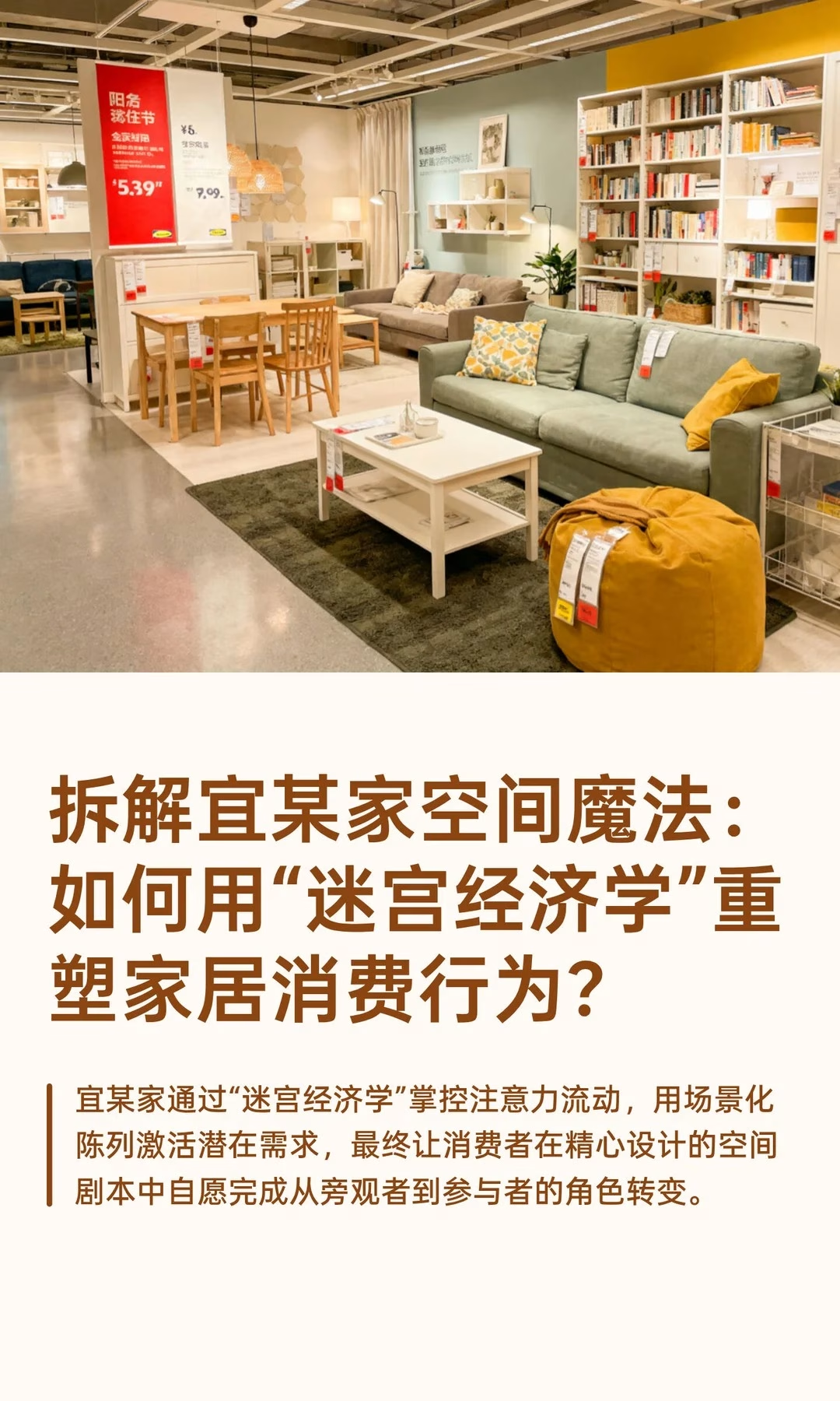
IKEA’s display system fuses categories into complete “life scenario” room sets rather than grouping by category — sparking purchase inspiration through a full spatial story instead of a spec-sheet comparison. Multi-sensory marketing, such as coffee aroma in the kitchen zone or textile scent in the bedroom zone, reinforces scene authenticity and emotional connection, while shoppers are actively encouraged to touch, try, and note product codes themselves — reducing sales-pitch intervention and building trust through hands-on autonomy instead.
Reshaping People, Product, and Place
Traditional retail chases “maximum product exposure”; IKEA instead pursues “optimal experience journey,” turning the physical path itself into a consumption narrative rather than a simple route between departments. Flat-pack packaging and self-service pickup convert operating cost savings into a price advantage shoppers can genuinely perceive at the register — and a $1 glass mug displayed alongside a $1,400 kitchen set cleverly builds a “value anchor” psychological effect that makes the whole store feel more affordable than it is.
Bottom line: through “maze economics,” IKEA controls attention flow and activates latent need through scenario-based display, letting shoppers voluntarily shift from bystander to participant inside a carefully written spatial script.
Smaller retailers rarely have the floor space to build a full forced path, but the underlying principle still scales down: even a modest store can sequence categories so that a shopper passes through one or two adjacent, complementary departments on the way to what they actually came in for, and can place one clear “value anchor” item near the entrance to set price expectations for everything that follows.
A short checklist for applying maze economics at a smaller scale:
- Sequence at least two complementary categories along the path to the store’s core destination
- Add one low-price, high-visibility item early in the path to anchor perceived value for everything after it
- Encourage touch and trial wherever safe and practical, rather than defaulting to look-but-don’t-touch
- Offer a visible shortcut for shoppers who clearly already know what they came for
Related: the pain-itch-delight-viral shopper psychology framework and MINISO’s magnet-point layout, compared. External reference: peer-reviewed environmental psychology research on retail spatial design (ScienceDirect/Elsevier) supports the dwell-time-to-impulse-purchase link above.