








KKV’s Visual Merchandising Secrets: Inside the Trendy Variety Chain
KKV doesn’t just sell products — it engineers an experience through deliberate visual merchandising. Here’s how this 1,000㎡+ trendy variety-store format guides foot traffic, builds visual “magnets,” and keeps conversion high across a huge footprint.
Foot Traffic: Guided Exploration, Extended Dwell Time
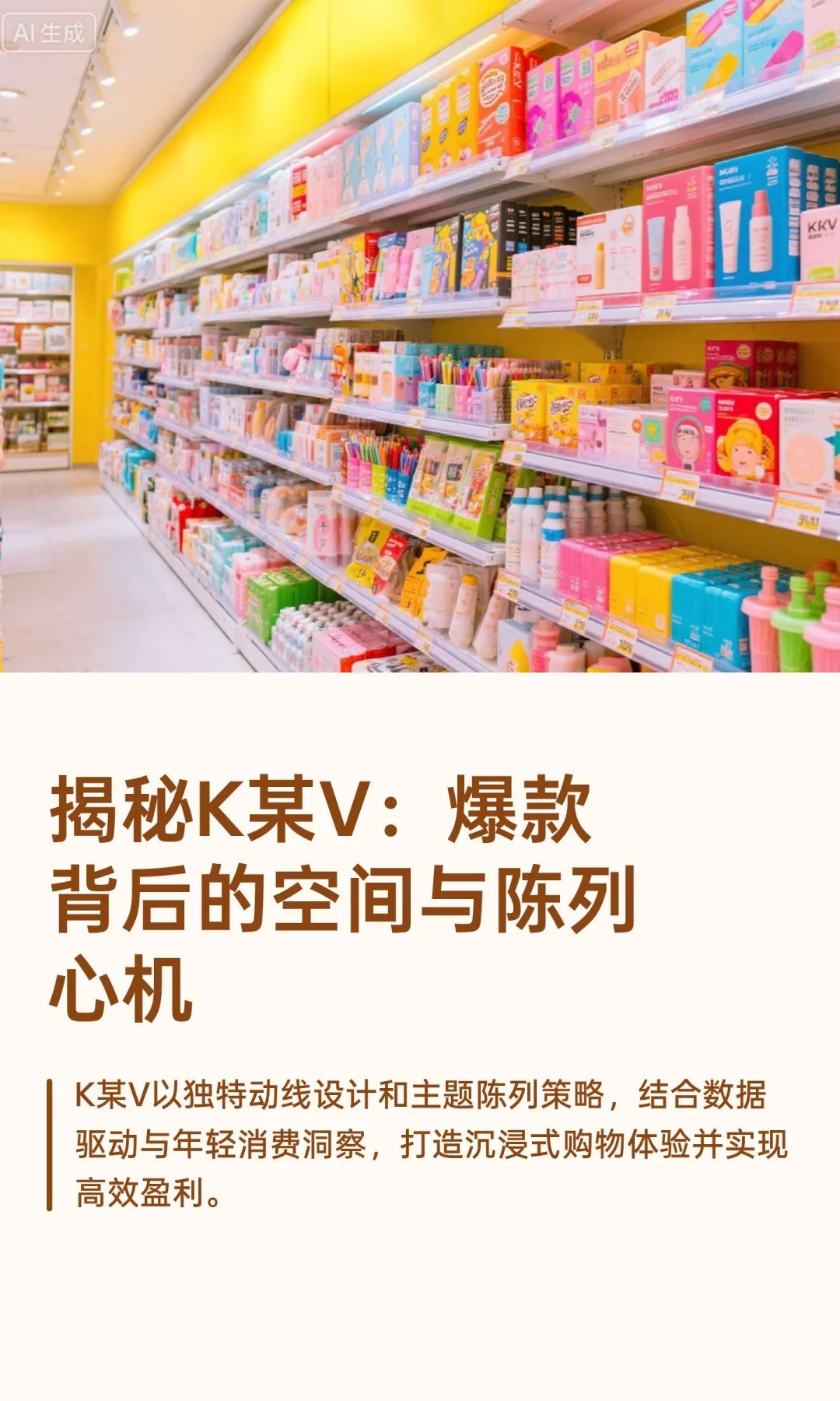
KKV’s main-loop-plus-visual-magnet layout uses a clear main path — typically circular or U-shaped — letting shoppers cover 1,000+ square meters without getting lost. The path strings together multiple themed zones, each anchored by a bold visual installation that becomes a “memory point” and a magnet, naturally pulling shoppers deeper into the store. These installations aren’t just display — they’re photo spots that drive secondary social sharing well beyond the store’s own reach.
Main aisles are deliberately wide, encouraging free movement, and product selection and display height depend heavily on data — SKUs get refreshed monthly based on sales figures and foot-traffic patterns, keeping the assortment feeling current rather than static.
Display Principles: Creating Surprise, Driving Conversion
Themed and scenario-based display uses color-coding — products arranged by color family for strong visual impact and a sense of order — and theme walls that turn a large volume of a single item into a spectacular, photo-worthy display in its own right. Precision shelf management, including vertical display, easy access, and fully-stocked shelves, is paired with a pressure-free, self-directed shopping experience that matches what younger shoppers actually want from a physical store.
What Sets KKV Apart
Extreme aesthetics and social value — bold color use and high-visual-appeal design strongly trigger the urge to share, making the store itself a “destination to visit” rather than simply a place to shop. Data-driven rapid iteration keeps the assortment feeling fresh through continuous SKU turnover, using a buyer-and-data-led system rather than gut-feel merchandising. And a precise read on young consumers — who value both “looks are justice” and “social currency” — shapes every product selection decision from packaging to placement.
Bottom line: the layout and display system is built around one goal — a “high-conversion playground” that uses visual magnets, themed scenarios, and data to reshape the relationship between people, product, and place.
The most transferable part of KKV’s playbook for other retailers is the monthly SKU-refresh discipline: rather than treating a floor reset as a once-a-season event, building the operational muscle to rotate a meaningful share of the assortment every four weeks keeps a store feeling newsworthy to repeat visitors — which is ultimately what earns the free foot traffic that photo-worthy installations are designed to generate in the first place.
A short checklist for any retailer testing a KKV-style format:
- Set a fixed monthly cadence for SKU rotation and hold to it even when it’s operationally inconvenient
- Build at least one color-blocked or theme-wall zone designed specifically to be photographed
- Track which installations actually generate social shares versus which just look good in person
- Keep the main aisle wide enough that shoppers never have to angle sideways past each other
Related: MINISO’s store layout design secrets and The Colorist’s color-coded beauty retail design. External reference: Visual Merchandising and Store Design (VMSD) covers store design trends relevant to this format as a dofollow citation.